Form
Form
It is a component that configured a form-type screen where items are separated by category rather than displayed in a list. It allows users to input, edit, query on a per-item basis. The fields from the Business Object are mapped to the Controls of the Form Component for use.
- How to Create
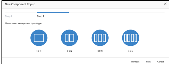
- Choose
Formtype in New Component Popup Screen. (Step1) - Set the
Layout Typeto apply the Screen. (Step2)
INFO
Note: For the convenience of screen layout, we provide Layout Types divided into 1 to 4 segments. Among these, you can choose the appropriate layout to set up the workspace in the Component Canvas(Detail) and configure the Components.
- Enter the Component Name and the name that should be displayed on the screen. (
Symbolic Stringor Custom Name). - After selecting Business Object that is used in the component , choose fields of the Business Object to be used in the Component
- Applicable Component Attribute
- Tab Pane Id: When the Screen is structured with a Tab Component and this Component is placed at the bottom, the Tab Component's Panel Id value is registered to link it with the Tab.
- Label: Used as the label for the Field, and its display position can be changed (Top: above, Left: to the left).
- Display Full Size Fixed: The component can be displayed in full-size on the screen.
- Style - Background Color: Set the background color for the Component.
- Style – Outline: Set the type of outline for the Component.
- Availabe Service
| Name | Platform | Description |
|---|---|---|
| load | Common | Event that occurs when data loading |
- Availabe List of Controls
Button: Actions registered as events trigerred by clicks or touches can be invoked.
Hidden: Controls can be hidden when the application is executed.
Lookup: To initiate a search, you can call a popup window, where users input search criteria and execute the search.
Text: It is an Input Text Form Control.
Select: It is a dropdown list, a Select Control, where you can choose an option. It utilizes the Group Code registered under
Common Codeto set the option values for the Selecting Control.Editor: It is a control used for editing simple document files.
Password: This a control used for masking the display or input of passwords or sensitive information.
ImageUpload: It is an Image Upload Control.
Textarea: Unlike
Textcontrol , this control allows for resizing and input of multi-row text.Radio: Radio Button, display the items of Radio Buttons by setting the Group Code registered under
Common Code.CheckBox: It is a Checkbox Control.
DatePicker: A control for entering dates, allowing users to easily select dates.
DateTimePicker: A control for entering dates and times, allowing users to easily select both.
TimeSelect: It is a control that assists users in selecting a time and displaying the selected time in a specified format.
Label: It is a read-only control. It can display fixed values or field values from a Business Object.
Dynamic: A dynamic control that is generated and used dynamically on the screen when a component is called in a Service's Action (such as Component-Interface, Control-Interface), with the Control Type set as metaData.
ZipCodeKR: Allows searching and setting addresses. In the Component, after searching for an address,postal codes, addresses, and detailed addresses can be mapped.