TimeSelect
This control allows users to select a time from a predefined lists or using a user interface element such as a dropdown menu or spinner. It assists users in selecting a time and ensures that the selected time is displayed in the specified format.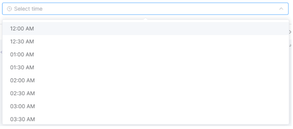
- Applicable List of Control Attributes
- Translate: Configures whether to convert to multiple languages(translation purpose).
- **Label:**Configures the screen display status, location, and tooltip of the component label.
- Display Format: Determines the format in which time data is displayed on the screen. For example, if set to
HH:mm, the time will be displayed as13:45. - Data Format: Specifies the format used when passing time data (for storage, retrieval, etc.).
- ime Interval: Allows setting the interval of time displayed in the dropdown list.
- Key-in Input Availability: Enables or disables the ability to enter time manually in the time select input field.
- Dropdown Time Range (Start): Sets the start time for the time dropdown list.
- Dropdown Time Range (End): Sets the end time for the time dropdown list.
- Style – Font: Configures the font for the string or text.
- Style– Text Color: Configures the color for the text.
- Style- Text Align: It allows users to set the alignment of data, with the default value being left-aligned.
- Style– Flat Appearance: Configures properties related to the border, such as its width, color, and other settings.
- Style– Background Color: Configures the background color of the component.
- Style– Text Align: It allows users to set the alignment of data, with the default value being left-aligned.
TIP
A. When the Default Value attribute is entered, it does not display according to the set Display Format, but rather as the received String itself.
B. When you set the Default Value attribute as a Script and the return value is a string, it displays correctly. However, if the return value is a Date object or similar, the control does not render.